Address
251 Little Falls Drive, Wilmington, DE 19808, United States

Struggling to get crisp, detailed results in MidJourney? You’re not alone. Many creators miss out on stunning visuals simply because they’re using the wrong styles. In this guide, we’ll explore the best styles in MidJourney to help you produce crystal-clear images. Ready to level up your AI-generated art? Let’s dive in and sharpen those pixels.
Table of Contents
Why clarity matters in MidJourney creations
Have you ever crafted a stunning image in MidJourney, only to find it slightly blurry or lacking that crisp finish? You’re not alone. Clarity plays a crucial role in how viewers perceive the quality of AI-generated art. In platforms like MidJourney, where aesthetics are everything, even small improvements in sharpness can take your visuals from “meh” to mesmerizing.
What affects image clarity in MidJourney?
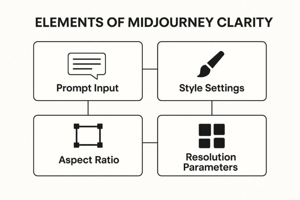
MidJourney’s image quality is influenced by a combination of prompt design, style settings, resolution parameters, and the AI’s interpretation of artistic intent. The software doesn’t just “draw” what you tell it, it interprets based on underlying models and style libraries. That’s why choosing the best styles in MidJourney makes a world of difference.
Style settings vs prompts: What’s the difference?
Many users confuse “styles” with prompt keywords. While both affect your results, they serve different functions. Style settings influence the overall visual language, think lighting, realism, or brushstroke simulation; while prompts guide the subject matter and composition. Styles act like a lens through which your prompt is filtered. Use both in harmony to achieve crystal-clear visuals.
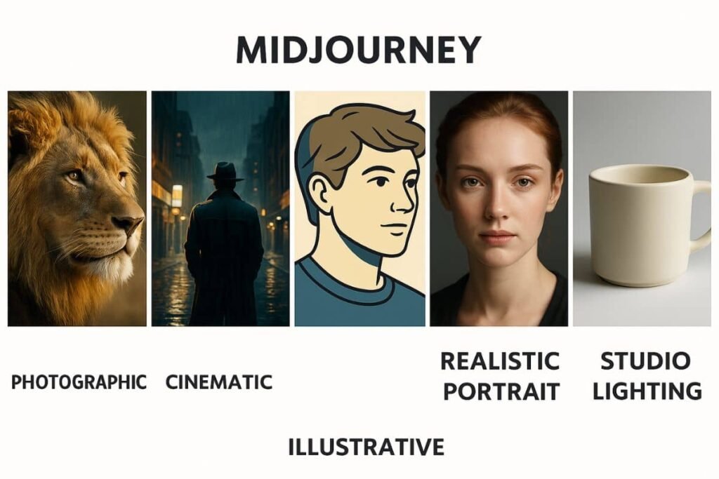
Top 5 styles that deliver crystal-clear results
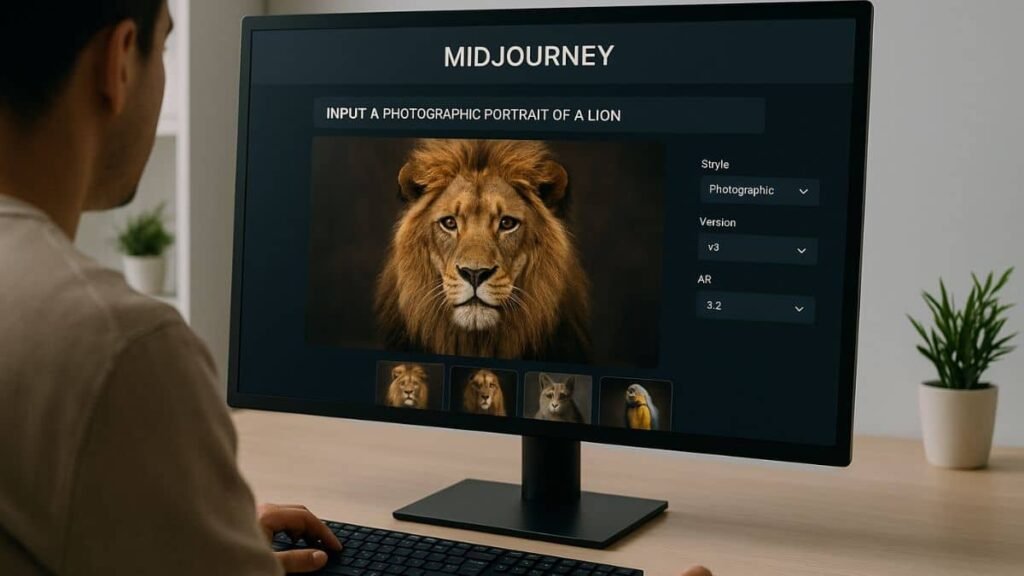
1. Photographic style
This is one of the most dependable styles for high clarity. It mimics real-life lighting and depth of field, giving images a natural, detailed finish. Try prompts like: “portrait of a lion, 85mm lens, photographic, –v 5 –ar 3:2”. It’s ideal for product mockups and character portraits.
2. Cinematic style
Want your images to look like a still from a movie? Cinematic style offers dramatic lighting and contrast, enhancing clarity through dynamic range. This style works well for storytelling visuals and mood-heavy compositions. It’s a favorite among creatives building concept art.
3. Illustrative style
While this leans more artistic, some variations produce extremely crisp results, especially when combined with high quality settings. It’s great for web comics, editorial content, and stylized branding. Add modifiers like “vector line art, clean shading” to keep edges sharp.
4. Realistic portrait style
If you’re focused on lifelike characters, this style is unmatched. It enhances skin texture, eye sharpness, and facial details. Use this in conjunction with --v 5.2 and --quality 2 for incredible depth and clarity.
5. Studio lighting style
For product visualization or clean backgrounds, studio lighting styles are a win. They eliminate visual noise and emphasize contours and texture. This style mimics a real-world photo shoot setup, think of glossy magazines or e-commerce visuals.
Style parameters that improve clarity
Alongside style choices, some specific parameters can boost clarity significantly. Understanding how these work is key to mastering MidJourney output.
–stylize (–s)
This controls how strongly MidJourney applies its artistic flair. Lower values (like --s 50) give you more literal and clearer images. Higher values can over-stylize and lead to a messier look.
–quality (–q)
The --quality tag affects render time and detail level. Using --q 2 will generate more detailed and refined results but may cost more GPU time. It’s worth it when image clarity matters.
–uplight vs –upbeta
--uplight tends to preserve soft shadows and avoids harsh contrasts, making it better for portraits and clean aesthetics. --upbeta delivers higher contrast and works better with dramatic styles like cinematic or noir.
For more details on style tags and parameter behavior, refer to the official MidJourney documentation.
Advanced style pairings for maximum clarity
Sometimes, the secret to achieving the best styles in MidJourney isn’t just picking one — it’s combining styles and modifiers strategically. Let’s look at a few powerful style pairings that can take your results from good to jaw-dropping.
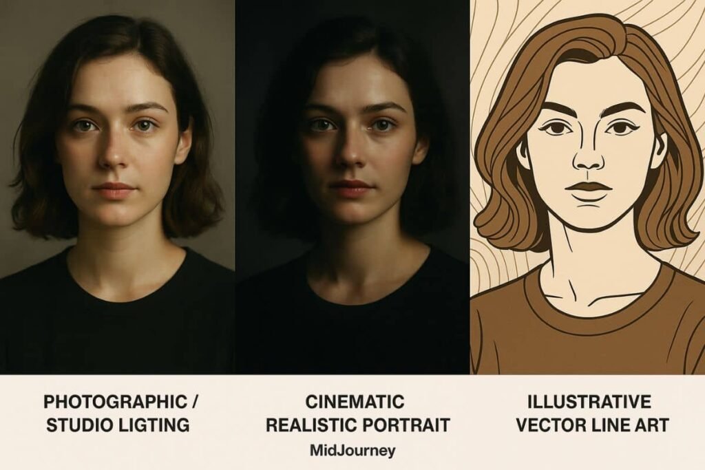
Photographic + Studio Lighting
This combination is ideal for ultra-clear product photos or character portraits. It mimics the look of professional photo studios with soft shadows, controlled highlights, and realistic textures. Try prompts like: “product on white background, photographic, studio lighting, –q 2 –ar 4:5”.
Cinematic + Realistic Portrait
Pairing cinematic lighting with a realism-focused portrait style produces emotionally rich yet incredibly sharp images. It’s perfect for AI film posters, profile images, or character concept art. Use --uplight to retain softness without losing structure.
Illustrative + Vector Line Art
For creators working on branding, editorial, or UI/UX illustrations, this duo delivers bold outlines and high visibility. Combine with --s 100 to preserve clarity without over-stylizing. This setup is fantastic for SVG exports or mobile-friendly designs.
Bonus tip: Use seed values for consistency
When pairing styles, consider locking in consistency with --seed. This helps test variations with clarity-focused parameters while keeping subject composition intact.
Want to dive deeper into prompt engineering and advanced MidJourney techniques? You’ll find step-by-step tutorials in our AI Tools Learning Hub.
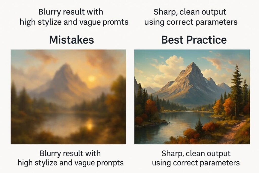
Common mistakes that lead to blurry outputs
Even with the best styles in MidJourney, small missteps can sabotage image quality. Let’s break down a few of the most common issues:
- Over-stylizing with high –s values: Using
--s 1000might sound appealing, but it often produces chaotic visuals. - Using vague or conflicting prompt language: Combining too many unrelated visual ideas can confuse the model.
- Neglecting aspect ratio: The default square format isn’t always ideal. Use
--arfor better composition and clarity. - Skipping quality modifiers: If you’re using
--q 1or below, you’re missing out on MidJourney’s full potential.
Avoid these pitfalls, and you’ll instantly notice sharper, more detailed outputs.
Real user examples: Before vs after using the right style
To highlight the power of style optimization, here are two real examples from users who shared their progress in the MidJourney community:
“I used to get blurry textures until I switched to photographic + –q 2 with
--uplight. Now my portraits are razor-sharp.” — @VisualFuelAI
“Swapping artistic for studio lighting gave my product renders the clarity I needed for my online store.” — @PixelCommerce
For those just starting out, we highly recommend reading our beginner guide: MidJourney Guide for Beginners.
Final tips for choosing the best style in MidJourney
To wrap up, here are some quick-fire tips to ensure you’re always using the best style for crystal-clear results:
- Match your style to your goal: Portraits? Go realistic. Fantasy? Try illustrative. Products? Studio lighting wins.
- Always adjust parameters: Styles alone aren’t magic. Use
--q,--s, and lighting flags strategically. - Use clear, focused prompts: Stick to 1–2 descriptive concepts and avoid stuffing your prompt with too many styles.
- Study successful images: Join AI art communities, like Reddit’s r/midjourney, to analyze what others are doing right.
Need help understanding parameters further? Check out the MidJourney beginner’s guide for official best practices.
Finding the best styles in MidJourney can instantly elevate your creative output. Whether you’re aiming for lifelike portraits, sleek product shots, or eye-catching illustrations, style choice makes all the difference. Experiment with our recommended pairings, adjust your parameters, and avoid common clarity pitfalls. Got a favorite style that works like magic? Share it in the comments or explore more tips in our learning hub.